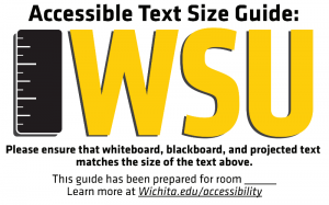
One of the challenges of delivering instruction in a face-to-face environment is the problem of making sure that visually presented content, text especially, is of a reasonable size for people to see. At Wichita State University, we developed a standard based on the ADA’s standards for signs, and have been placing signs and stickers in all of our instructional spaces to indicate the size that text should be given the space.
Why this is challenging
In the past we have made recommendations like “please use an 18pt font in your powerpoint presentations” and that is not a terrible place to start, but since the resolution of computers, the resolution and quality of projectors, the size of the screen and the distance from the projector to the screen all play a dramatic role in determining the size of text presented on a screen, it’s simply not possible to ensure that text is big enough without evaluating it in the setting where it will be delivered. An 18pt font in one room may be adequate, and simply way too small in another.
So, we need to provide a standard that exists in the room and that eliminates the problem presented by the inherent variables (and that also addresses the appropriate size for text written on whiteboards and blackboards in a given space). To that end, we have created our “Text-Size Stickers”.
Understanding the standard
The ADA’s sign standard requires that text in a sign be at least one inch high for every ten feet of usable space, with a minimum of two inches. By “usable space,” they mean the distance at which the user should be able to read and use the sign. In our case, that’s the distance to the most distant seat a student might be in for the class.
It’s important to consider the farthest seat in the class. Requiring students with low vision to sit close to the front of the room violates their right not to disclose their disability, and it violates their right to choose to sit in other parts of the classroom if those areas are more comfortable for them for other reasons. A student should not have to choose between their low vision and their social anxiety, for example, when choosing a place to sit. Since accessibility is about making our instruction available to students in a way that does not require accommodations of their impairments, we have to set the goal of ensuring reasonable visibility in the back of the learning space.
The Stickers

Our stickers have been created in sizes from two inches (for a learning space where the furthest seat is 20 feet from the screen or whiteboard) to 6 inches (for a learning space where the furthest seat is 60 fee from the screen or whiteboard). We have placed one in every classroom, next to the whiteboard or where the projector screen displays so that it’s easy to evaluate the size of text as it’s displayed on the screen or on the whiteboard.
Messaging
It’s important to understand that the stickers represent a standard that most instructors will find challenging to implement. Depending upon the space they teach in, their projectors and screens and so on — the font size may be MUCH larger than the 18pt font we are used to recommending. It’s very quickly apparent that whiteboards are very challenging to use in large classrooms.
Training related to the stickers should indicate that if content can’t meet those standards it must be delivered on another cognitive channel that is accessible to the student. So, if the text can’t be big enough to meet the standards expressed by the sticker, then the words should also explicitly be spoken to the class.
The Impact
At WSU we’ve seen a lot of interesting reaction to the stickers. There’s a minority of instructional staff who complain about the expectations of the stickers, who complain that the standards are too large, etc. We talk individually with those folks and encourage them to think about ensuring their content is delivered in multiple ways, and so on.
By and large, though, the impact of the stickers is not even just the people are presenting more readable content for their audiences. An even greater impact has been felt in the way people area aware of accessibility and continue to think about it as they go about their work. With a constant reminder in every classroom they enter, instructional staff are never far from the idea that accessibility is something we should be trying to achieve, and it has had a dramatic impact on our culture change efforts campus-wide.
Creating your own stickers.
The sample image presented above is the image of a three-inch text guide for a classroom with a learning space of up to 30 feet. Its branded with Wichtia State University’s initials and colors, but we expect that our friends in the accessibility community might want to put their own colors and name in the stickers. To help make that possible, we’ve put together a more generic package so that you can create your own versions of the stickers for your own institution.
Included in this package are the Adobe Illustrator files used to create the stickers at the various sizes.


