Topic 6: Tables, Lists, and Graphs
Tables
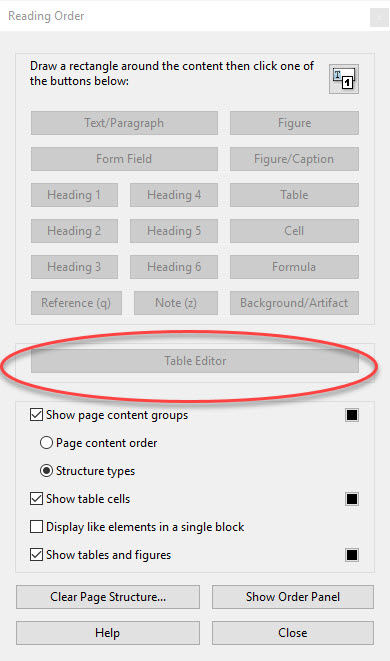
Tables can be especially problematic for alternative technologies, but there are ways to make them accessible. Using header rows and header columns can greatly increase everyone’s understanding of the organization of the information. For Microsoft Office products, go to Table Properties and make sure that “Repeat as header row at the top of each page” is checked. Place your cursor within the table and click on the design tab, making sure that “header row” and “first column” are checked. In Adobe, you will need to access the Table Editor by clicking on the Accessibility button and then selecting Reading Order. When the Reading Order window opens, click on the Table Editor button. Ensure that the tags and reading order within the table are accurate and correct as needed.
Lists
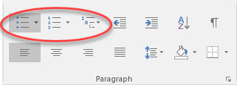
A list will only be read as a list by assistive technology if it was formatted as such when created. If it was not, the content will be difficult for screen readers to fully understand. In Microsoft Office products, place your cursor within the list and look to the Paragraph group of the Home tab. If any of the formatted list selections are highlighted, your list is formatted as such. If it is not, simply highlight your list and select a formatting.
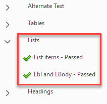
In Adobe Acrobat, the accessibility checker will check that lists are tagged as such; however, it is always a good idea to double check your tags for accuracy.
Graphs
Graphs are visual representation of data, and as such must be presented in other ways for those using assistive technology. Although all graphs should have alt text, it is not sufficient way to present the amount of data contained within a graph. Presenting the graph information both within the graph and within text or table form can better serve multiple audiences at once, providing a better and often more-detailed explanation of the data. Providing a text description adjacent to the graph can help all readers better understand the data. The description should be an explanatory analysis of the data, not a point-by-point description of every minute piece of data. Creating a simple table of the graph data is another option; however, you will need to ensure the table is fully accessible!
Another issue with graphs is color. Color is often used for differentiation and to convey meaning; however, to someone who is color-blind or has low-vision, all elements may look the same and blend together. Using different textures or different shades of the same color can help alleviate this issue.